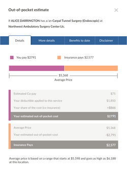
Out-of-pocket cost explanation
UX / UI Design
Usability testing and research preformed by Dr. Allison Greco and Maggie Foree.
Arguably one of the most complicated things about health care is understanding why you pay what you pay. I worked on this feature to explain the cost breakdown to the user. The solution provides an overview and allows the user to dig deeper if they wish. This design went through three rounds of testing and iteration until we came up with this design. The original design, three design iterations, and the final design are shown below.
Goal Redesign presentation of OOP details information to better explain where the cost numbers come from and to build trust with the user that we do know who they are and what their insurance covers.
Target use case Users looking to understand how cost numbers were calculated to evaluate accuracy.
Result Provides users with a comprehensive understanding of what they pay and what their insurance pays for a specific service, and the impact to their deductible and out-of-pocket max.
Problems with the original version
The prior version of the app's out-of-pocket cost explanation had some problems. A usability researcher on my team conducted a usability test on this version to identify some of the major usability problems.

Three design iteration rounds with usability testing
Scroll through the three designs that were tested before landing on the final design.


Final design
After three rounds of usability testing and design iterations this final design was tested and approved. It uses a tabbed modal to parse information into sections with progressive disclosure.

All four tabs are full of useful information, but parsed in a way that the user is not overwhelmed.
 |  |
|---|---|
 |  |